
This year we are celebrating with four Vertex Design Awards!
We know that we’re bragging, but we couldn’t hide our excitement, that even after several lockdowns due to COVID 19. That we were awarded with not one, but two Gold Vertex Awards!
Being created in 2012, the Vertex Awards are the only global competition devoted exclusively to the Private Brand package design. With experts from around the world, the awards are judged based on Creativity, Marketability, and Innovation.
The recognition of being awarded for these two Brand and Packaging Designs for O&O Eggs and Miere Romaneasca for our client in Romania, proves that even products that are usually presented in a standard way can be fun and stand out on the shelves!
The packing of Eisler Rice and Gradini Bunicii won the bronze awards, with both bringing storytelling in a fresh way, being transported to a new decade of flavors!

GOLD - PROFI MIERE ROMANEASCA, ROMANIA
Meaning Honey from Romania, the strategy started by creating a range for organic and natural honey related to this same country.
The concept is based in a delicate and natural design, that uses soft colors to distinguish aromas, and handmade illustrations that immediately connects the consumer with the organic nature of the product and the country’s customs and known traditions.
The packaging’s architecture was developed, aiming to highlight the world of honey, with a graphical language that refers to a product that comes directly from the source, the work of the beekeeper.
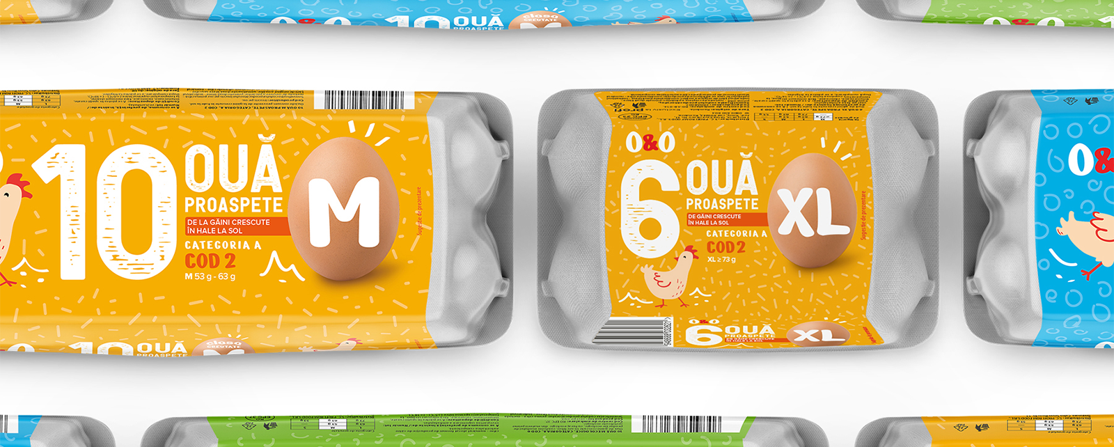
GOLD - PROFI O&O EGGS, ROMANIA
The Design team had the challenge to redesign an already established brand and reposition the range to be more appealing for the younger generations.
With this in mind the design suffered major updates, this included a new brand logo that creates a blend between tradition and the joyful side of eggs with vibrant colors and handmade illustrations complementing this new way to communicate by appealing to the natural side of the product.
The decision to fully change the communication was an important key so that the consumer could easily distinguish and understand the different egg types, sizes, and quantities, due to the big and bold information displayed at the packaging, giving it personality.
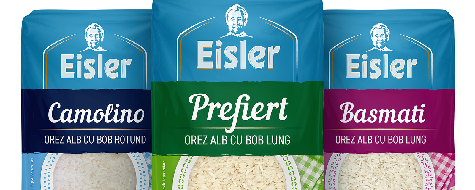
BRONZE - PROFI EISLER RICE, ROMANIA
Eisler needed to be repositioned as a referenced rice brand at the local Romanian market, for that a new trustworthy positioning, reinforcing the history behind it, was introduced in this rebrand.
The brand’s redesign highlights its heritage by becoming part of the central focal point of the package design. The newly embraced color coding intends to separate Eisler from the competition when placed side-by-side, gaining a contemporary look & feel, thus becoming more appealing.
The newly introduced communication is reinforced by a secondary color code, that helps to distinguish the different types of rice, as well as a new central transparent window, providing the consumer the visualization of the product characteristics inside of the package.

BRONZE – PROFI GRADINA BUNICII, ROMANIA
Meaning literal “Grandma’s garden” in Romanian, Gradini Bunicii is a brand that solely focused on fresh fruits and vegetables.
The concept starts by creating a redesign that creates an emotional and trustworthy connection with the consumer. And this is where that name’s meaning comes to the top of our creative minds, by aligning the brand’s values with its meaning.
The design focuses on the idea of grandma’s fresh quality ingredients with an honest aesthetics, formulating an interesting balance between tradition and modernity. Here the real freshness of the products are the main elements, due to its bold photography and usage of nature related colors that contrasts with the product’s imagery on the pack.
Otherwise, a wise grandmother, proud of her fresh ingredients, that wants to share her honest products from her garden to our homes.
More about the Vertex Awards: www.vertexawards.org

Dig deeper into this with Jens Sievert