
Your true nature. More than a brand, Bare is a personal statement on empowering people to embrace
naturalness and being positive about themselves.
naturalness and being positive about themselves.

Bare is a new gender-neutral Health & Beauty brand created for the Philippine market. The brief was focused on
the idea of having a boutique brand that could be found in any specialised H&B store in the world, but in this
case developed for Landers, a wholesale retail chain.
the idea of having a boutique brand that could be found in any specialised H&B store in the world, but in this
case developed for Landers, a wholesale retail chain.
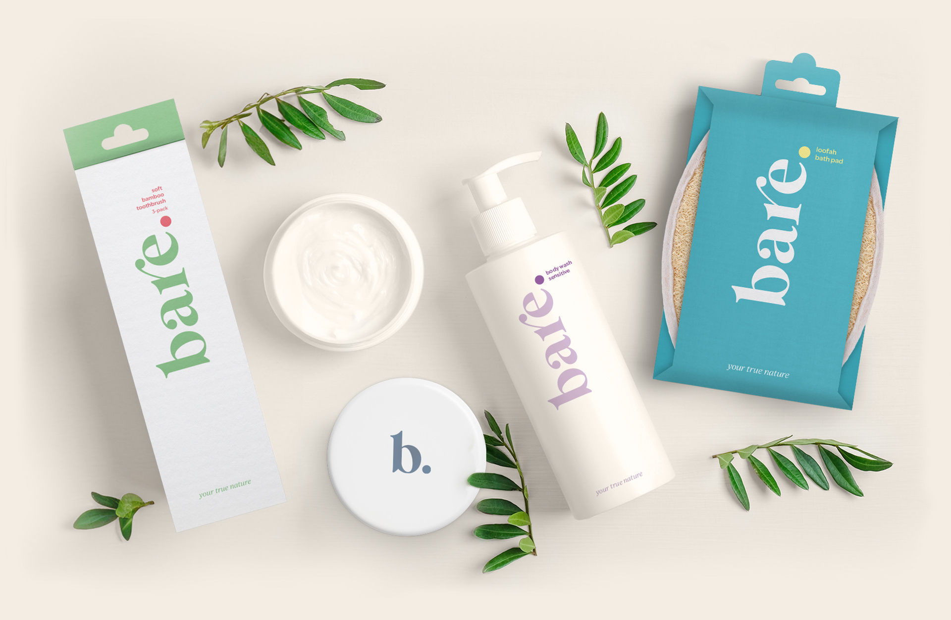
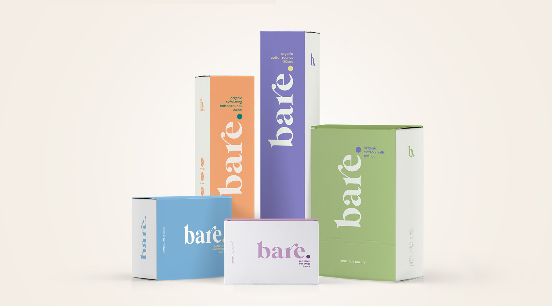
Bare is all about being ourselves, stripped from any artificial layer. The idea of getting bare naked, the simplicity and the absence of gender-marked solutions gives birth to a brand that reflects comfort and brightness.
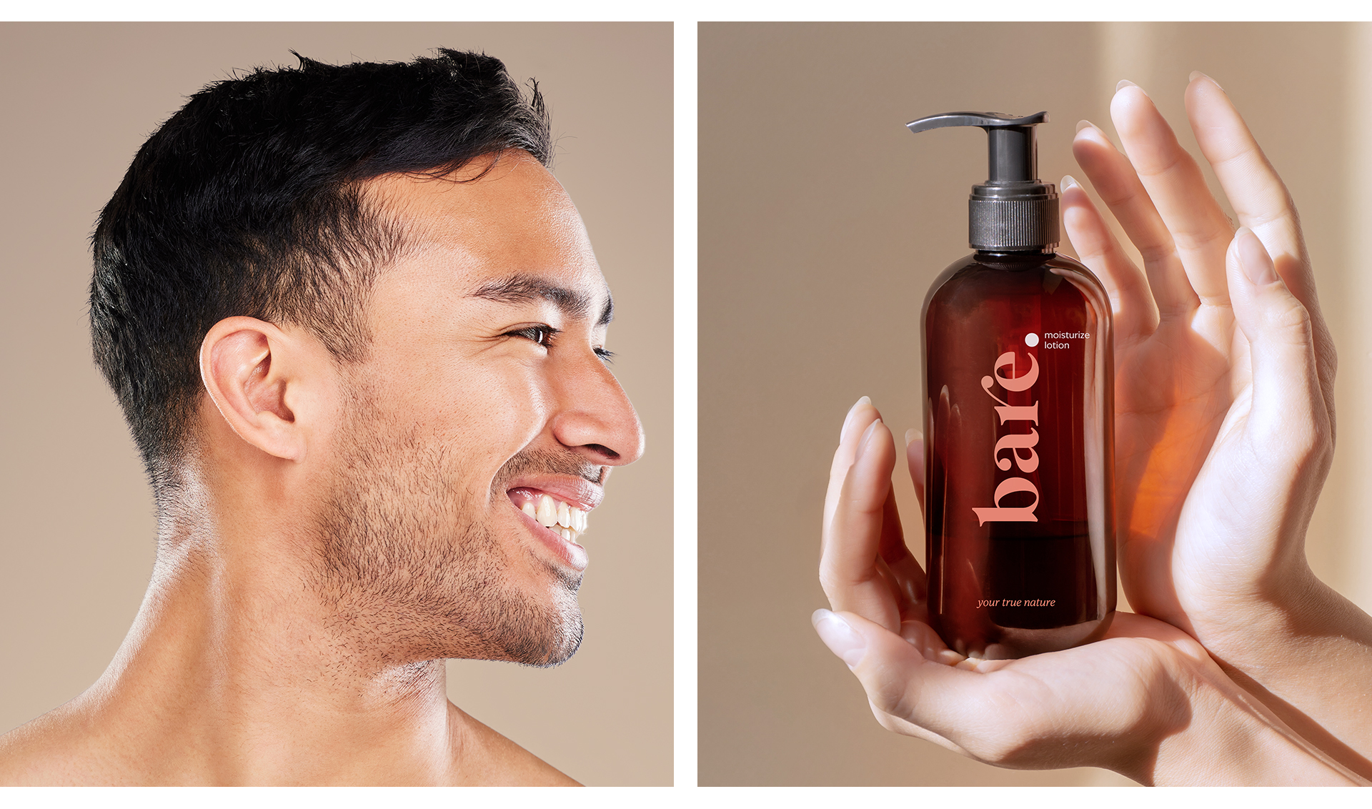
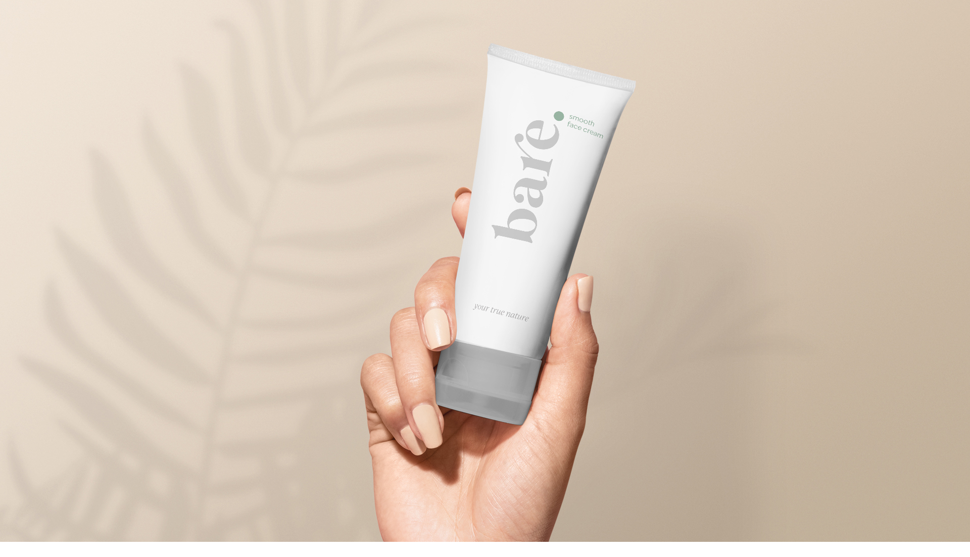
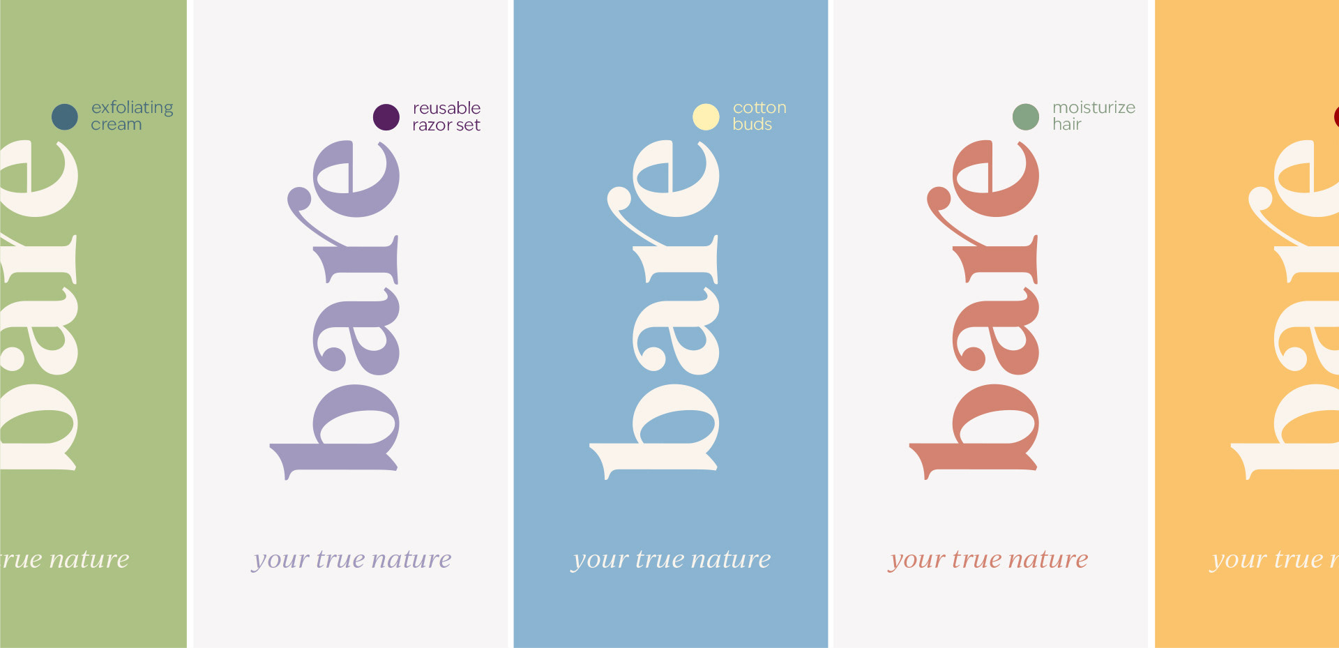
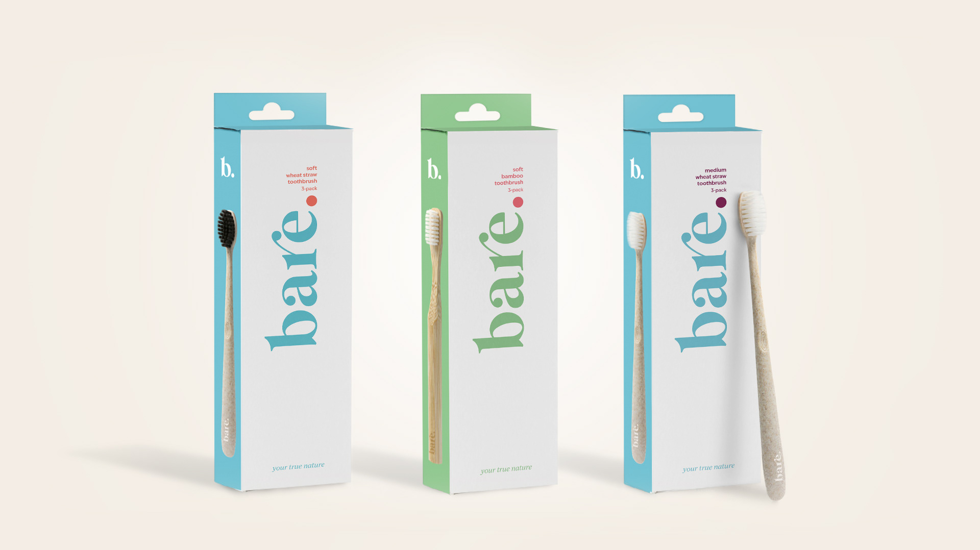
By using soft tones and a very visible brand logotype on pack, the visual identity of Bare is simple yet impactful.
The logotype is bold and delicate at the same time. It is used as a statement and not only as a brand name. It features
a final point at the end of the word “bare.” so that it is understood as an affirmative sentence. This dot changes color depending on the product fragrance, being the focal point for the product descriptor on the front of the label.
a final point at the end of the word “bare.” so that it is understood as an affirmative sentence. This dot changes color depending on the product fragrance, being the focal point for the product descriptor on the front of the label.
Each label uses only three colors maximum, permitting to keep printing costs low, and contributing to the branding simplicity.
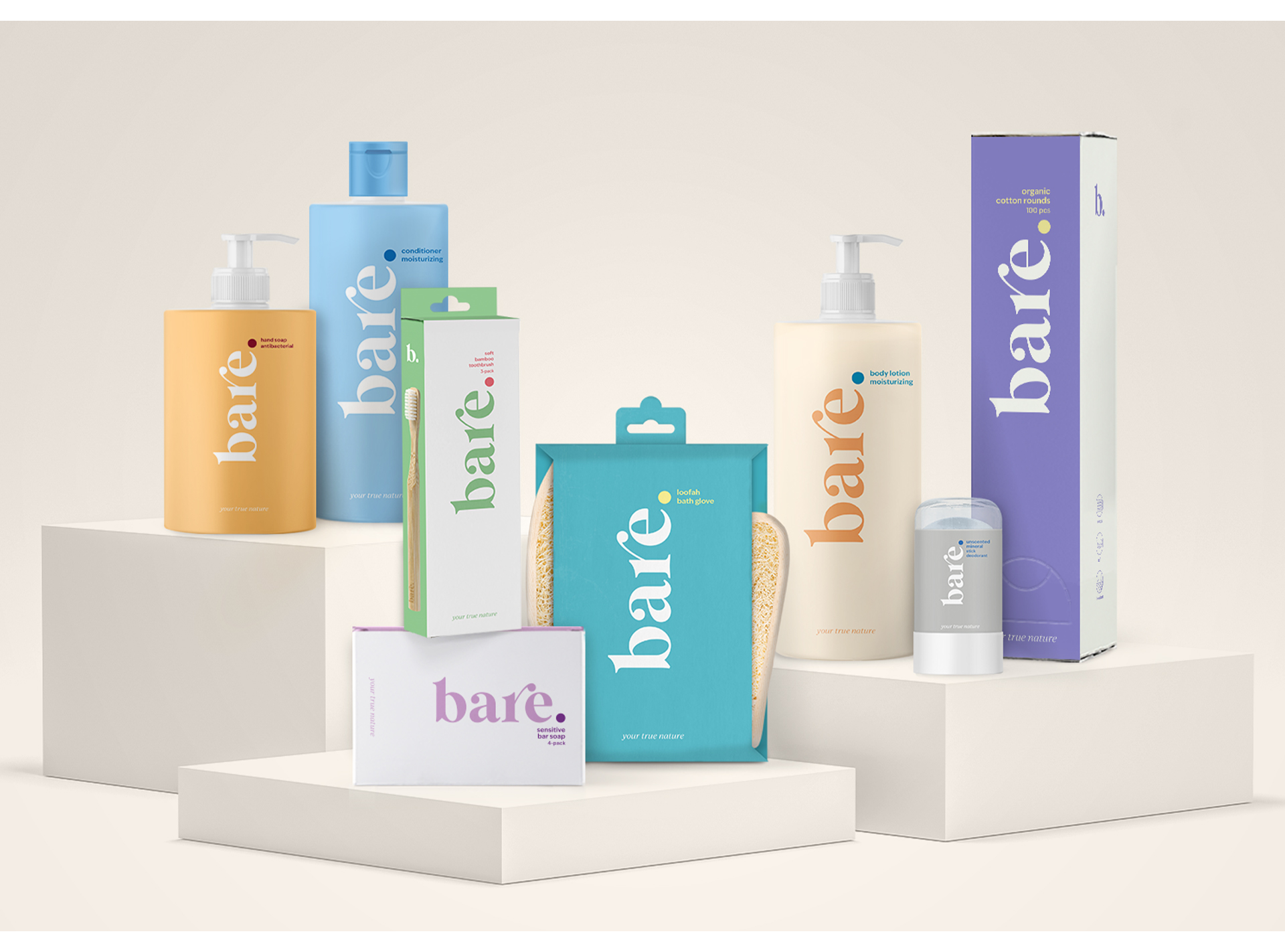
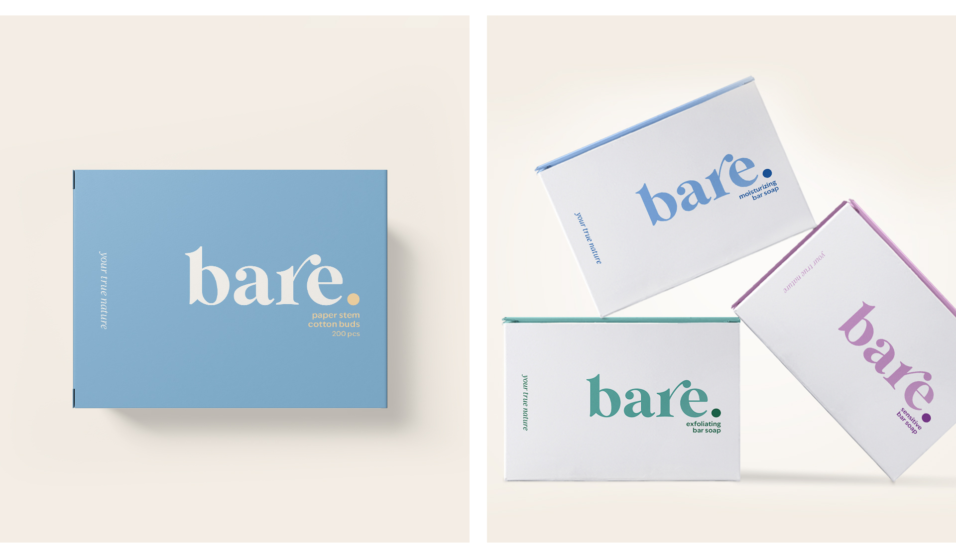
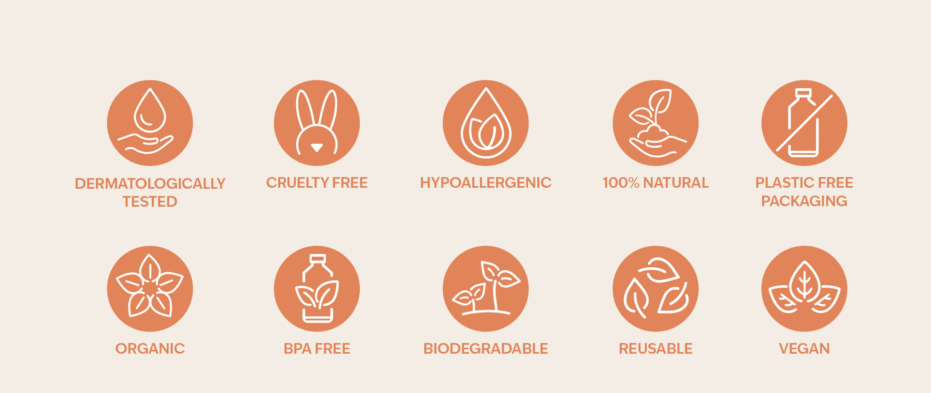
Bare embraces new consumer trends such as inclusivity, gender neutrality and eco-consciousness.
These concerns are present in the label design, package design regarding materials and usability, in the
products' formulas and brand communication.
These concerns are present in the label design, package design regarding materials and usability, in the
products' formulas and brand communication.