

A Friendly Smile
Client: Makro | Market: Brazil
Client: Makro | Market: Brazil
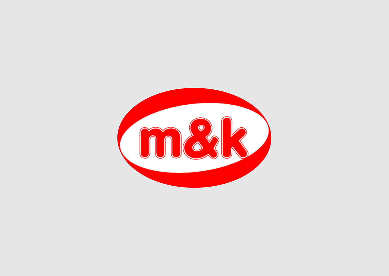
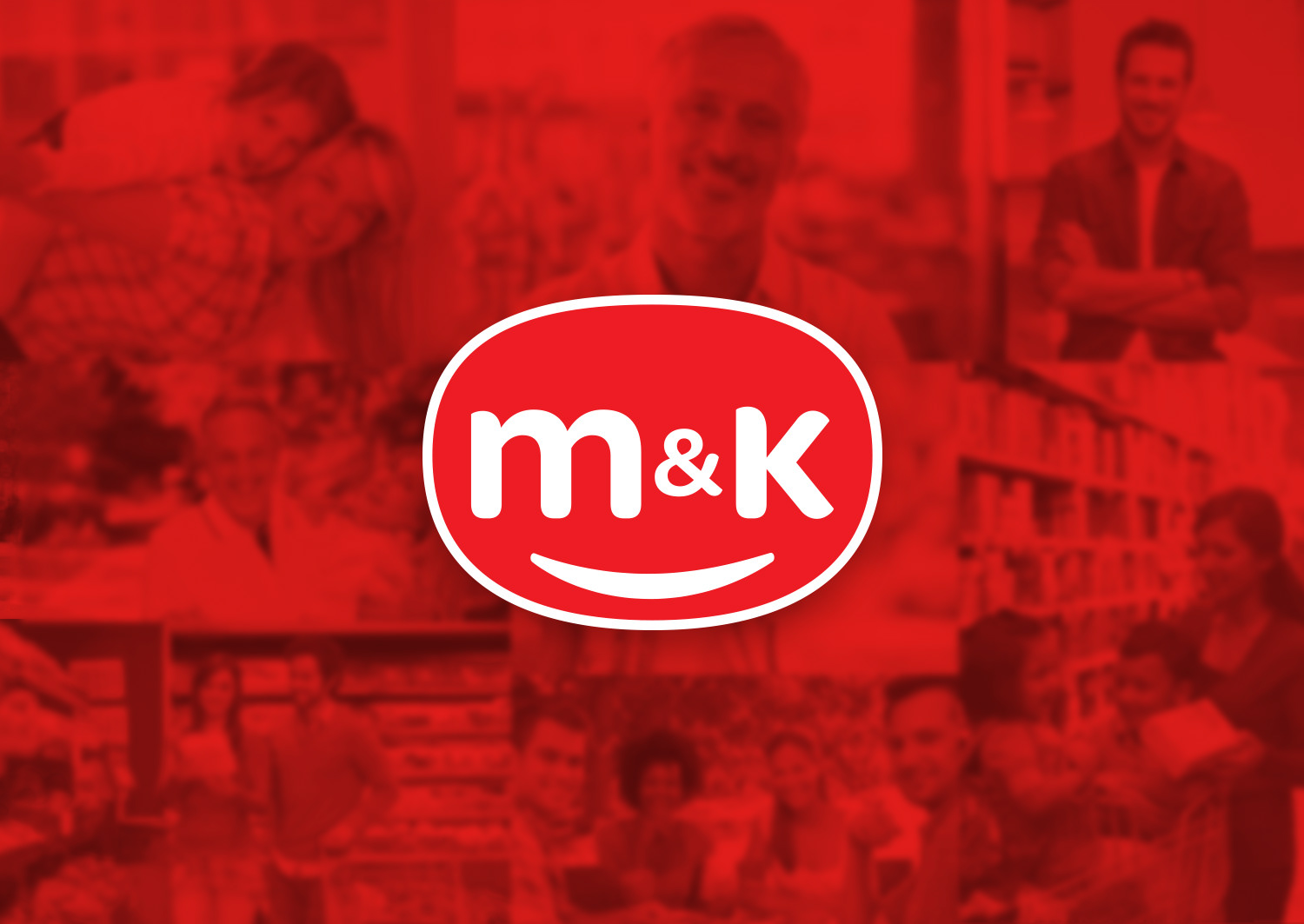
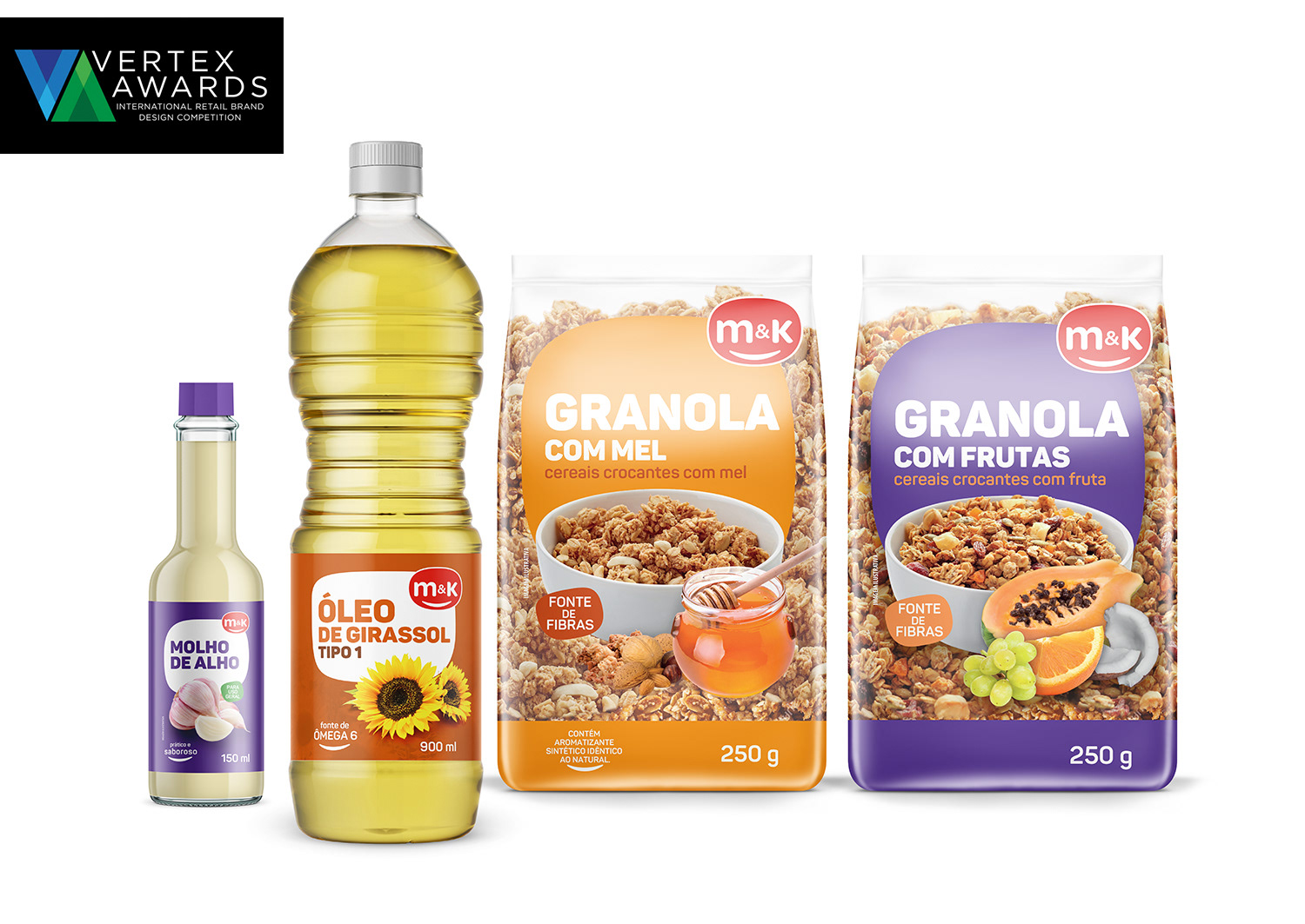
M&K brand targets customers in small retail stores in Brazil. This type of stores is typically visited by people looking for good and affordable products. The challenge was to do a rebranding that embraces this proximity relationship with customers, that transmits a first price feeling and that still has a strong and fun presence.
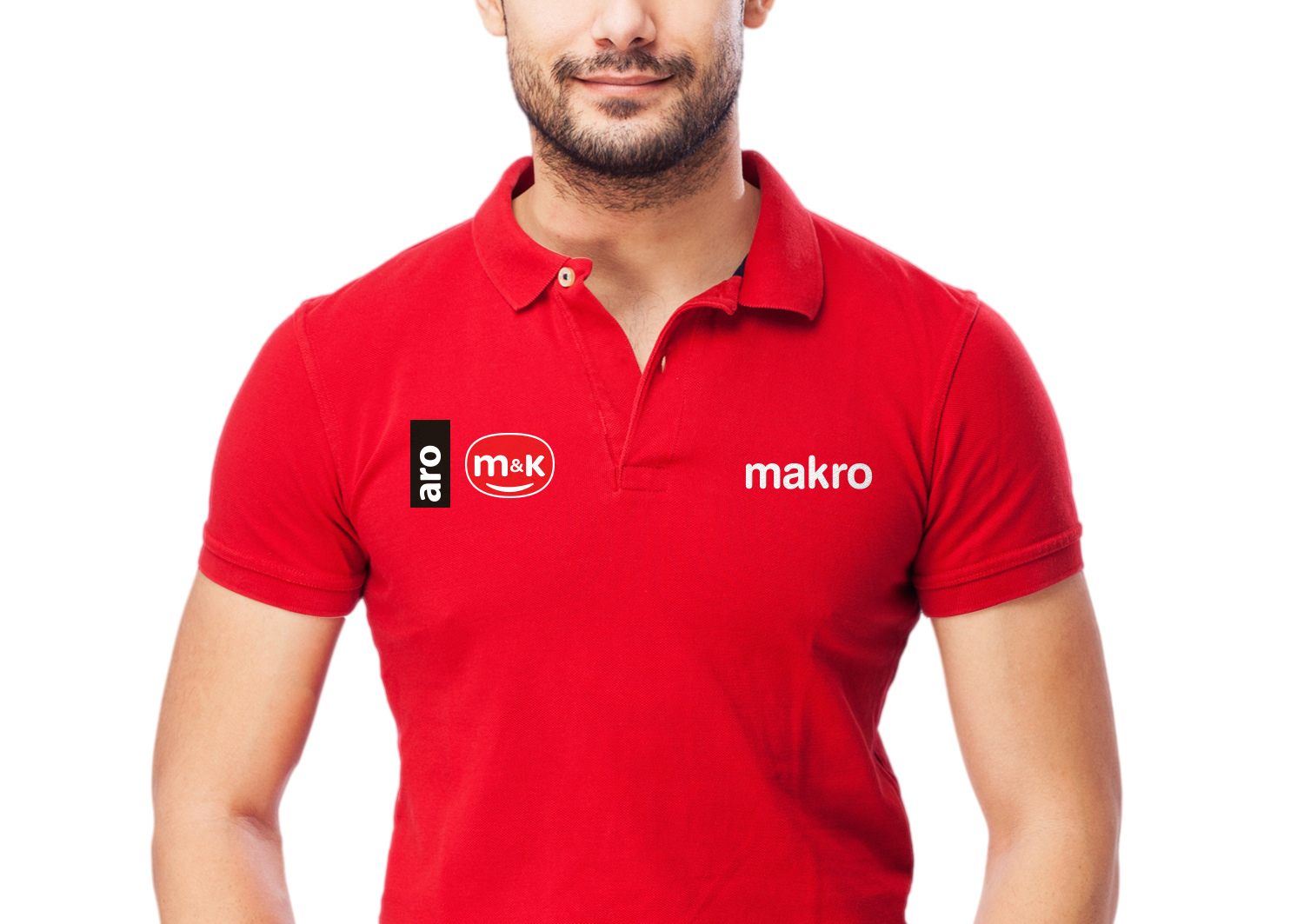
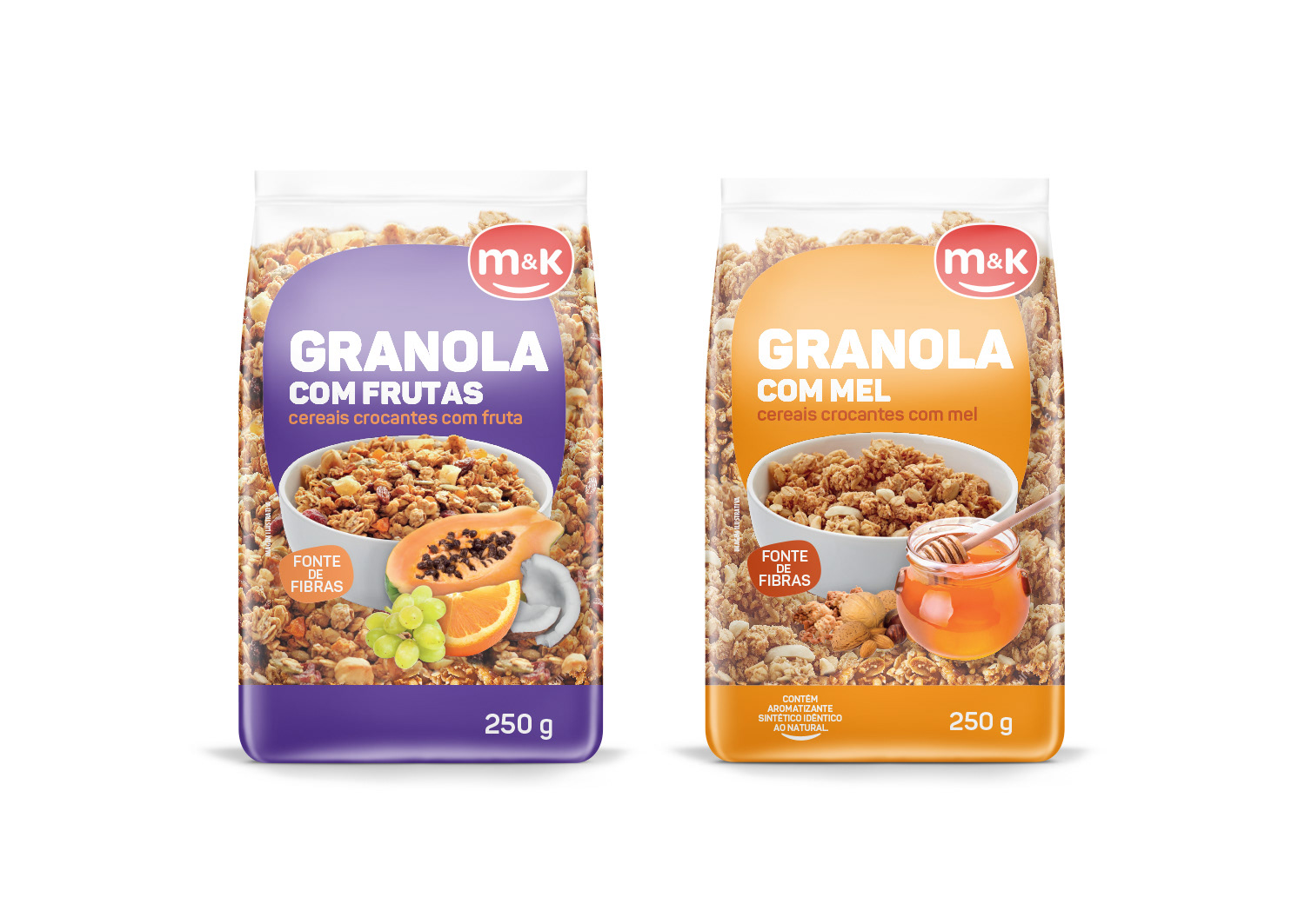
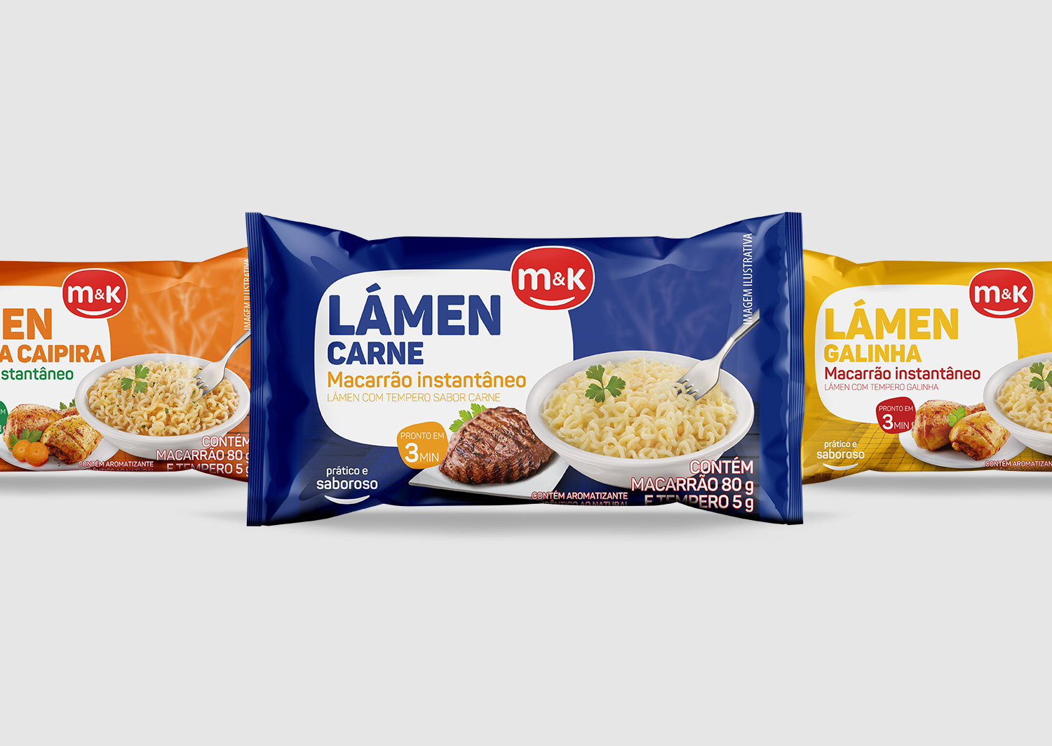
The solution was first to change the logotype in to a happy face feeling. The face of a friendly neighbor. The packaging needed to be obvious and the solution was that each product has a strong and vivid color to call for attention on shelf but also to transmit the idea of a first price choice.
Typography is big and bold for an easy reading. The organic rounded white shape form permits an area that can adapt to each packaging or label format and gives the brand a consistent identity across all ranges.
In result, M&K is a friendly brand offering value for money.
Vertex Design Awards – Bronze Award Winner 2017