


The Challenge
Profi Romania wanted to revamp their mainstream supermarket brand and bring into the local market a personalized approach. This new brand identity symbolizes the repositioning of their stores, creating a new line of products that relates to younger generations.
The Solution
Bold and highly visible on shelf is the key to show that something new has arrived in stores. Increase the quality perception of products to gain trust and lead consumers to try it. A new story line that seduces consumers with a new offering, with and identity that is fresh and adaptable. To become authentic and innovative in the Romanian market.
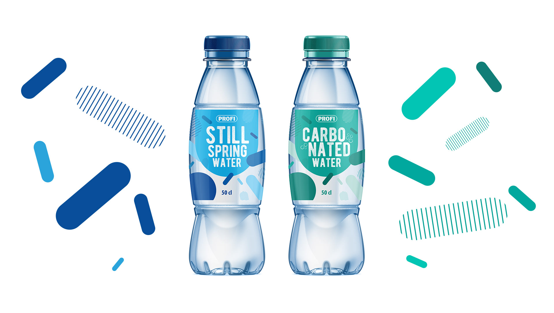
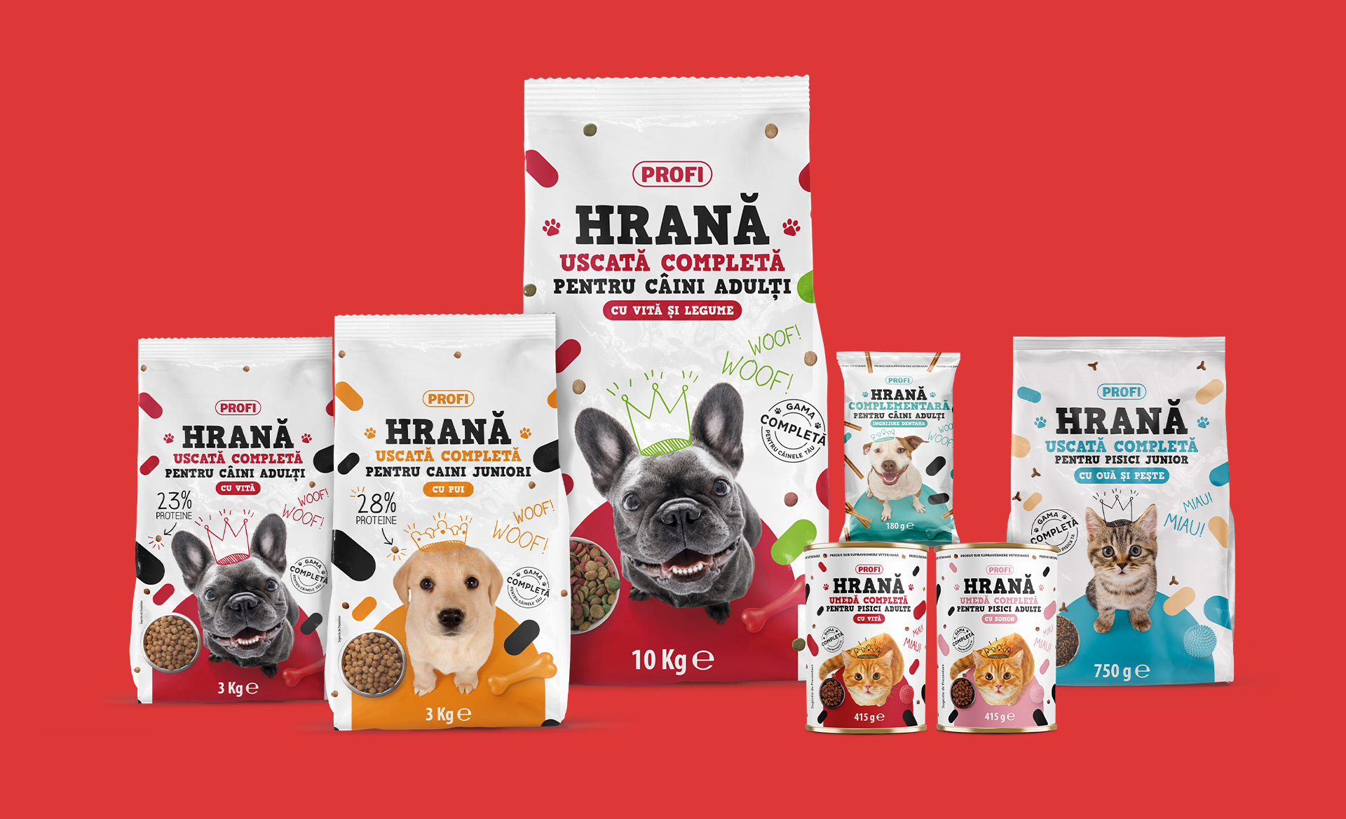
An explosion of elements!
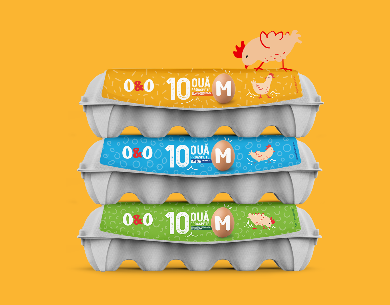
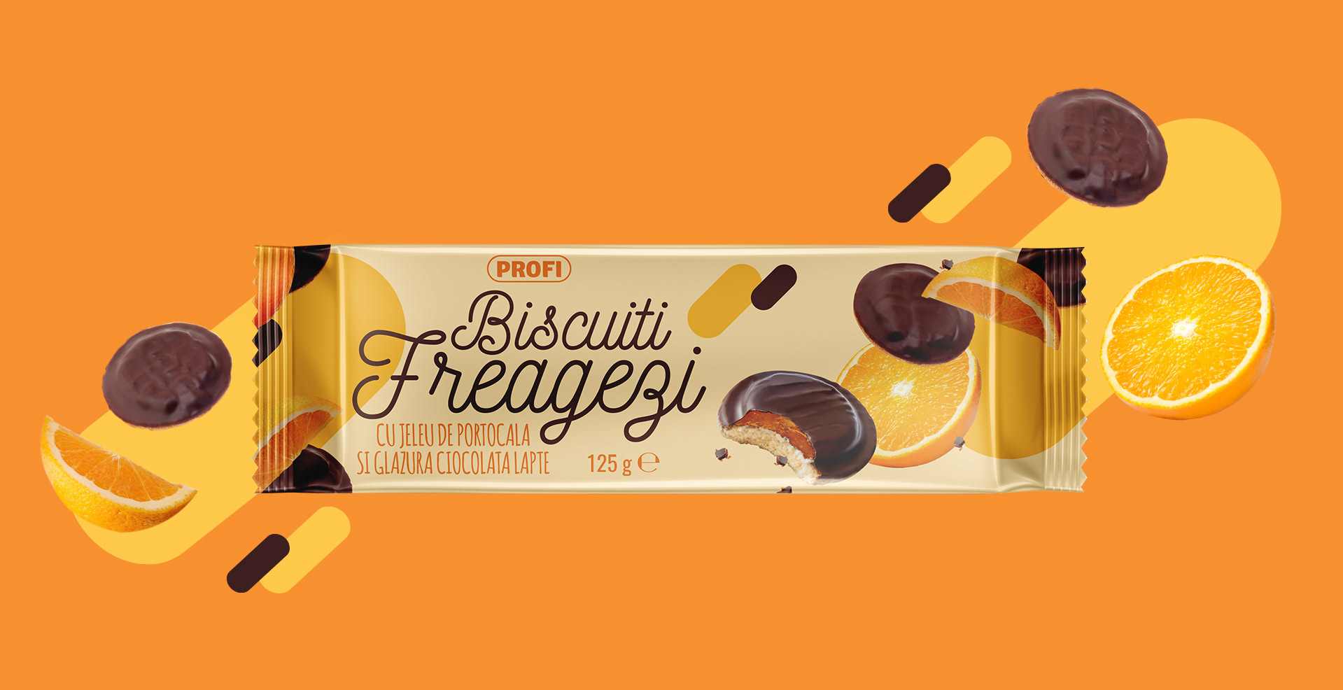
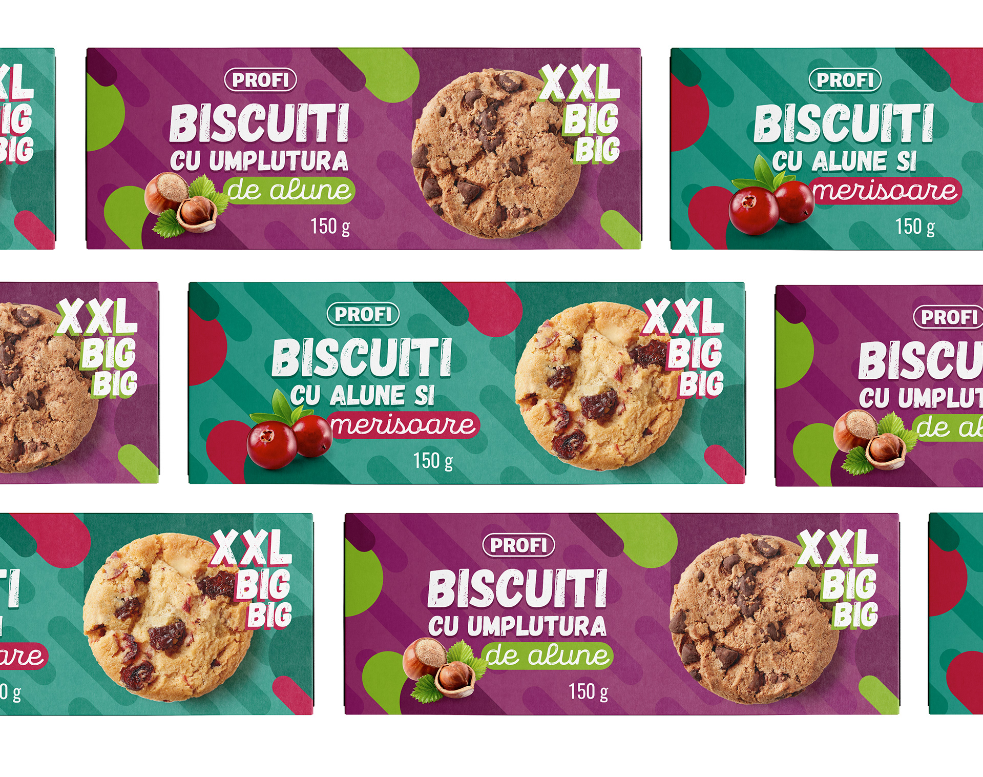
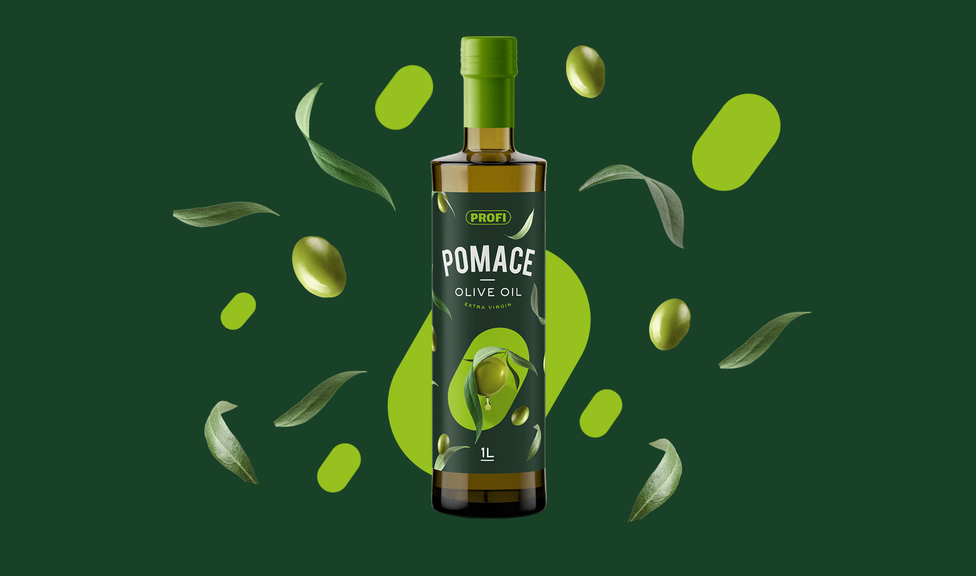
The solution is born from the brand itself. The packaging Design promotes the start of a new interpretation of the Profi logotype. By playing with the elements, the brand starts to evolve and gain new visual attributes each time a new range is designed. It’s a packaging Design that visually contributes to the construction of a new brand identity for Profi as a retailer.
An explosion of elements!
The solution is born from the brand itself. The packaging Design promotes the start of a new interpretation of the Profi logotype. By playing with the elements, the brand starts to evolve and gain new visual attributes each time a new range is designed. It’s a packaging Design that visually contributes to the construction of a new brand identity for Profi as a retailer.
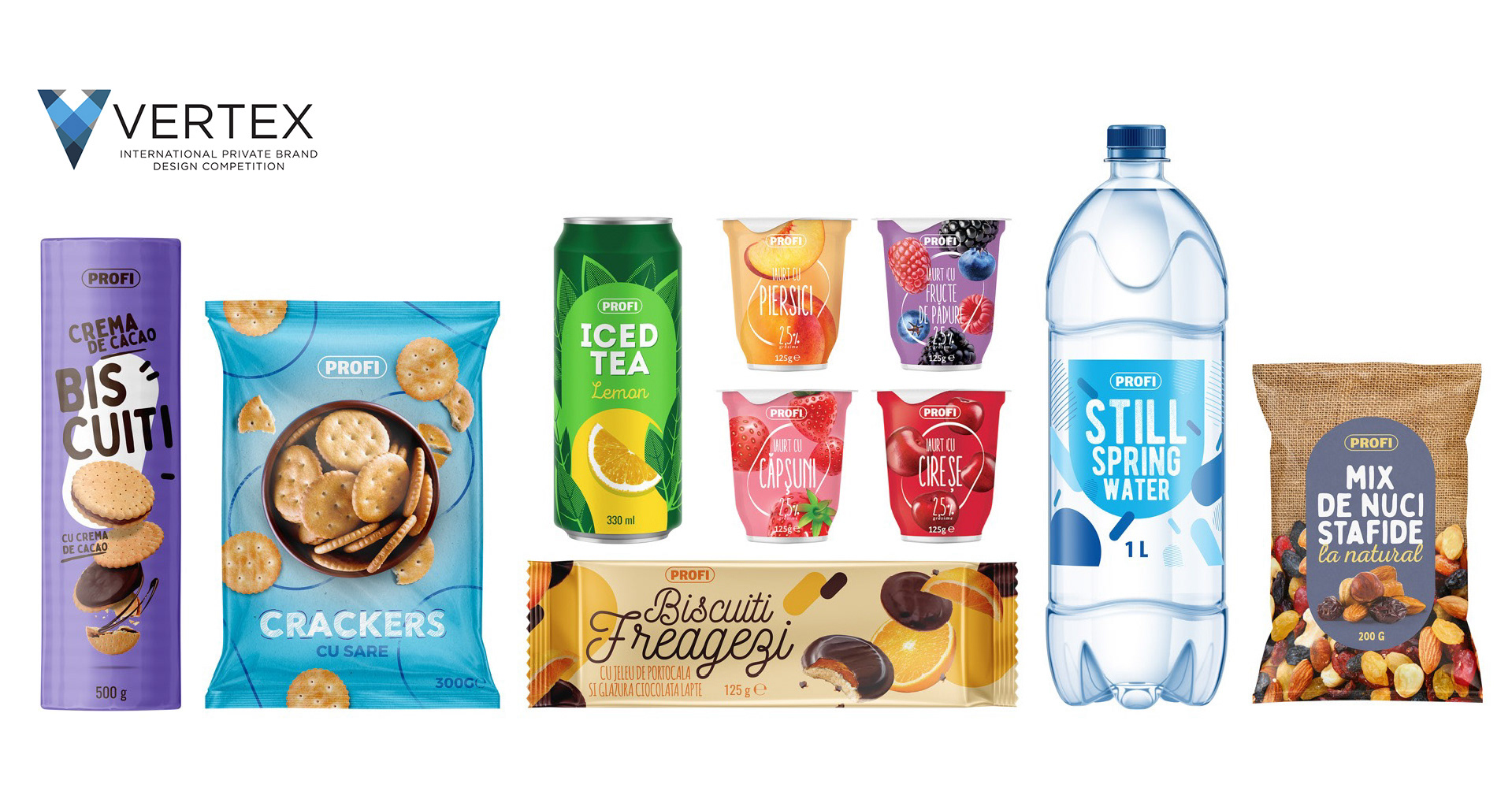
Vertex Design Awards – Bronze Award Winner 2020